Chat

Chat is a family of components for building chat interfaces, including message alignment, colored bubbles, avatars, headers, and footers.

Basic Usage

It's over Anakin, I have the high ground.
You underestimate my power!
Code Example
Basic.vue

Components

The Chat components include the following:

  • Chat - The main wrapper for a chat message or sequence.
  • ChatBubble - The colored speech bubble for chat messages.
  • ChatImage - Displays an avatar next to a chat bubble.
  • ChatHeader - The header area for a chat message.
  • ChatFooter - The footer area for a chat message.

Chat

The main wrapper for a chat message or sequence. Controls alignment and whitespace.

Chat Props Type Description
pre
boolean

Preserves whitespace and line breaks in the chat content.

align
string

Controls alignment of the chat message. Options: start, end. Default is start.

   
start
boolean

Shortcut for align="start".

   
end
boolean

Shortcut for align="end".

Chat Slots Description
default

The default slot. Place ChatBubble, ChatImage, ChatHeader, ChatFooter, or other content here.

ChatBubble

The colored speech bubble for chat messages. Supports semantic color props or a custom color string.

ChatBubble Props Type Description
color
string

Sets the color of the chat bubble. Options: neutral, primary, secondary, accent, info, success, warning, error.

   
neutral
boolean

Shortcut for color="neutral".

   
primary
boolean

Shortcut for color="primary".

   
secondary
boolean

Shortcut for color="secondary".

   
accent
boolean

Shortcut for color="accent".

   
info
boolean

Shortcut for color="info".

   
success
boolean

Shortcut for color="success".

   
warning
boolean

Shortcut for color="warning".

   
error
boolean

Shortcut for color="error".

ChatBubble Slots Description
default

The default slot. Content to be displayed inside the chat bubble.

ChatImage

Displays an avatar next to a chat bubble. Uses the Avatar component under the hood, so all Avatar props are also supported.

ChatImage Slots Description
default

The default slot. Content (such as an or icon) to be displayed as the chat image.

ChatHeader

The header area for a chat message. Use for names, timestamps, or status.

ChatHeader Slots Description
default

The default slot. Content to be displayed in the chat header.

The footer area for a chat message. Use for metadata, reactions, or actions.

ChatFooter Slots Description
default

The default slot. Content to be displayed in the chat footer.

Examples

Avatars

Demonstrates how to display avatars next to chat bubbles using the ChatImage component.

It's over Anakin, I have the high ground.
You underestimate my power!
Code Example
Avatars.vue

Bubble Color

Shows how to use the color prop on ChatBubble to set semantic colors for chat messages.

It's over Anakin, I have the high ground.
You underestimate my power!
Code Example
BubbleColor.vue

Pre

Demonstrates the pre prop on Chat to preserve whitespace and line breaks in chat content.

It's over Anakin, I have the high ground.
You underestimate my power!
Code Example
Pre.vue

Shows how to use ChatHeader and ChatFooter for names, timestamps, and status in chat messages.

Obi-Wan Kenobi
You were the chosen one!
Anakin Skywalker
I hate you!
Code Example
WithHeaderAndFooter.vue

Images

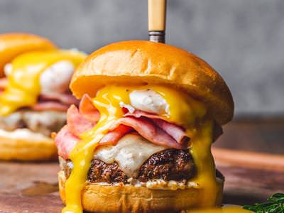
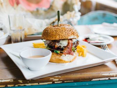
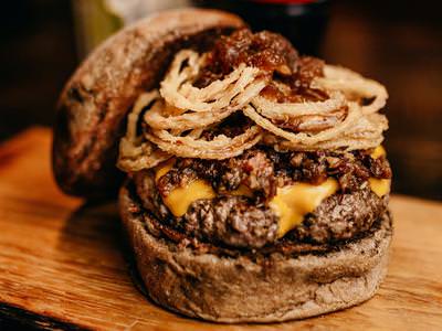
Demonstrates how to display a stack of images sent by a user in a chat bubble.
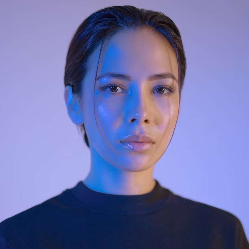
User avatar
Check out these photos!
Sent image 1Sent image 2Sent image 3
Code Example
Images.vue